Wednesday 15 December 2010
Tuesday 14 December 2010

Sunday 12 December 2010

Thursday 2 December 2010
Tuesday 30 November 2010
Evaluation Question 3
What Have You Learned From Your Audience Feedback ?
I filmed peoples feedback comments on the rough cut of my music video and for the rough digi-pak and rough magazine advert compositions.
These were the responses we got for our rough cut music video:
Using these comments we was able to know exactly what we needed to edit or improve on, the main things we had to change were;
- The gap between the band scene and bedroom scene
- Lip-syncing on certain parts
- The long shot of the guitar in band scene
The most of our audience was really happy with the video and the feedback made us feel proud to know we achieved a pretty good video even as the rough cut. However, for the improvement feedback we plan to;
- Insert a long shot of the band together in between the band scene and bedroom scene
- Re-lipsync certain parts
- Shorten the guitar shot in band scene and use another shot of the artist singing


These were the responses we got for our rough digi-pak and magazine advert:
Getting these comments about our photographs and the theme throughout reassured me because I was proud of what I had achieved but I didn't mind getting criticism as that means it will only make my work look better as well as fit our audiences needs. The only things we needed to change was:
- Edit the back of the digi-pak as it was too plain
- Edit the magazine advert photo as it was too dark
What we plan to do to improve these points:
- Use a location shot of graffiti, fade it
- Edit the magazine photo to make it lighter and of higher quality

We also received feedback through Facebook, as we created a group for our artist Lola Malibu; uploading videos, images and statuses by her on it. This was an easy way to gain feedback as people could just comment on a picture or video link.

I was happy with the feedback we got as they commented about the good bits as well as what we can improve on to make it look better also, we had audience demand to get the final music video up which made me feel happy as people were excited to see our work.
From these feedback videos and posts we received constructive criticism as well as aspects we should keep, I was pleased with the feedback as it only helped us improve on what we needed to in order to satisfy our target audience.
Sunday 28 November 2010
Friday 26 November 2010
Evaluation Question 1
In What Way Does Your Media Product Use, Develop or Challenge Forms and Conventions of Real Media Products ?
Part 1
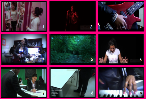
1. A shot that shows a link between lyrics and/or music and visuals
This image relates to the lyrics at this part as the lyrics are 'I'm tired of being compared to damn Britney Spears'. This is displayed with Lola acting fed up and pointing at the Britney Spears poster on the wall with a sense of hate and annoyance.2. A shot that typifies the way way a record company would want their artist to be represented
This shot reflects the way our record label 'Rage Ent.' would want our artist to be portrayed as this image is of Lola being at a live gig making her seem popular as well as; showing she is interactive, confident through her body language, professional, in the spotlight and how she displays her character through her costume. In the rest of the scene, the multiple camera angled shots represent an energetic, upbeat atmosphere which our artist is, this is an exciting representation to have which is more likely to engage a wider audience.
3. A shot that illustrates how your video uses music genre
We illustrated music genre in our video mainly by props and instruments, this electric guitar immediately links to a rock theme as it is a rock genre convention. The leather jacket and overpowering accessories of Lola give away a punky, pop genre sense. Also, we received a comment about how this specific guitar shot emphasises on our rock genre.
4. A shot that shows an intertextual reference
This shot reflect the intertextual referance of 'Wheatus-Teenage Dirtbag', as the band all play instruments they shows this effectively as the background music was from the instruments they were playing. Also, they used various camera angles of them playing these instruments in which we have done, this shot shows a very talented artist as well as the artist being outside of the narrative.
5. A shot that demonstrates your use of camera
This shot was the longest, most effective shot illustrating an isolated, secluded character that just want to get away. Our added faded 2-character effect increased the atmosphere being displayed, as well as the location and use of natural lighting. To create this shot we had to position the camera in one place without any zooming or panning, so we thought about the effect we wanted to create before actually filming this scene which was beneficial for us.
6. A shot that demonstrates your use of lighting
Using this lighting for this shot was important as we had to ensure we created a strong, spot light on Lola but manage to keep a dark, solid, black background to keep the focus on Lola and the t-shirts as this scene is very intense as it displays an emotional, depressed girl.
7. A shot that demonstrates your use of mise-en-scene
This shot of a school classroom represents a normal lifestyle of the majority of people today especially the audience we are targeting at which could be relatable to and make the audience feel involved. Having Lola sitting by herself continues the theme of loneliness as she feels like an outcast even in a comfortable, everyday environment like school. Having Lola day dreaming, the teacher shouting at her and classmates laughing at her automatically adds to the fed-up, alone mood which suits our narrative and we achieved this with the mise-en-scene.
8. Two shots which you feel demonstrate something which shows you have watched other music videos
This introductory shot to our music video, is a convention every music video has at the beginning and sometimes end of their music videos to let the audience know some key information about the video. This makes the video look that much more professional and what I have learnt from my research.
9.
Close up shots of instruments are very common in almost every music video, this is something I found from my research and chose to use various shots of instruments to highlight a rhythmical atmosphere and also add to our genre from the instruments we used.
Part 2

1. A shot that shows a link between lyrics and/or music and visuals
Kanye West- Runaway; Representing the lyrics and title of this song, his visuals illustrate Kanye West running away. The audience do not know from what and the distorted background suggests a sense of confusion and a frightening atmosphere. The main focus is of the character running away, engaging the audience to listen to the rest of the song so they know what Kanye is running from.Part 2

2. A shot that typifies the way a record company would want their artist to be represented
Keri Hilson - The Way You Love Me; In this video Keri Hilson is portrayed as a figure wearing almost close to nothing, her record label are illustrating her as an object and this is the way they want her to be presented. This follows Laura Mulvey's theory of the male gaze as Keri's costume, dance moves and surroundings give of a sexual atmosphere as in the music industry sex sells. This video also demonstrates Keri's character as being a 'female boss', a bit crazy and very seductive, engaging an audience.3. A shot that illustrates how a video uses music genre
Kings of Leon - Notion; The instruments used in this video such as the drums, synthesizer and electric guitar exaggerates on the rock/pop genre. The background being of a brick wall with flames of fire coming in adds to the solid, cold, rock genre. The band members have a very 'Topshop style' sense of fashion which suits the genre of rock as well as the dark colours.4. A shot that shows an intertextual reference
Limp Bizkit - Rollin' and Pink - Get The Party Started; The costume of the girls in these videos are very similar which could be a link between the two as the genre of both artists are pop/rock. 5. A shot that demonstrates the use of camera
The Black Eyed Peas - I Gotta Feeling; The camera use in this video is intense yet energetic especially in this shot as it is a medium shot of Will.I.Am falling in a slow motion where as the background is still moving as usual. Several quick, close up shots are used as well in sync with the beat moving fast and slow which is just as effective.6. A shot that demonstrates the use of lighting
Coldplay - Clocks; Throughout the whole video the lighting is very powerful and upbeat which is very effective. The light is exaggerated as the beat gets louder working very well as a whole performance, the strobe lights are very energetic as well as the use of green, red, blue and white coloured lights.7. A shot that demonstrates the use of mise-en-scene
The Saturdays - Higher; the mise-en-scene of this shot shows the girls in their American setting interacting with people from the street which makes them seem very approachable and playful. You can tell it's set in an American way because of the tall buildings, the yellow bus and cabs, the fact that its American themed illustrates a more professional, glamorous lifestyle for the girls. Having a variety of people around them just having fun in traffic, with a blurry background suggests they are living for the moment. 8. A shot that demonstrates the use of camera work
The Ting Tings - Shut Up And Let Me Go; The camera work on this video is done very carefully, to suit the beat and zoom in each time they want to create the graphic image. I think it looks very interesting and unique as it gives you a sense of escapism, they way the zooming in and out is done. The fact that the surroundings are quite simple yet colourful adds to the focus of the graphic image which makes it more effective.
The Ting Tings - Shut Up And Let Me Go; The camera work on this video is done very carefully, to suit the beat and zoom in each time they want to create the graphic image. I think it looks very interesting and unique as it gives you a sense of escapism, they way the zooming in and out is done. The fact that the surroundings are quite simple yet colourful adds to the focus of the graphic image which makes it more effective.
Wednesday 24 November 2010
Time Frame
Start Evaluation by 25th Nov
Question 1, 2 and 4 at home
Question 3 - edit feedback in college and voice record me and Anisha
Q4-Plan out Prezi to complete for 28th Nov
Finish by 1st December!!
Question 1, 2 and 4 at home
Question 3 - edit feedback in college and voice record me and Anisha
Q4-Plan out Prezi to complete for 28th Nov
Finish by 1st December!!
Tuesday 23 November 2010
Monday 22 November 2010
Before And After Photograph


Sunday 21 November 2010
Rough Magazine Ad Feedback

With these comments, I am able to improve on the criticism to create a final piece that will satisfy my audience.
I plan to change the photo and it, add the date and where the album songs are available at, hopefully it will be successful after that.
Rough Magazine Ad

I created this magazine advert using a similar photograph to the one on the digi-pak so people could identify them together and for it to be more easily recognised.
I included the album name, artist name, a review from NME, a hardcopy of the digi-pak and our production logo; these are all conventions of a magazine advert as I have researched earlier.
I will now get feedback for this to see what I need to improve on or change to satisfy my target audience.
Saturday 20 November 2010
Magazine Ad Sketches And Ideas
I produced sketches of what our magazine ad may look like using the photographs we already had. After analysing magazine adverts I knew what ours had to include, conventions like; album name and artists, ratings, where its available at, what date it is out or out now, the no.1 single it includes and possibly a picture of the album.
I had to ensure these were all visible on the magazine ad and that the main photo and font writing all links to the album so the audience can easily identify it.


Friday 19 November 2010
Photographs To Use
 |
| This photograph could be used but adding the writing may take the focus away from the photo and look too busy which is not what we want. |
 |
| I edited this photograph earlier as a potential idea for our digi-pak cover and thought we could use it for the magazine advert so people could recognise it automatically. |
 |
| This photo sticks to the theme and illustrates the bad girl which could contrast with the digi-pak cover effectively. There is enough space to add all the information needed as well. |
Our Magazine Feature

The NME magazine website is a music company that would most likely feature our music album, I edited it our album on the website to see how well it would fit in under album reviews.
New Musical Express focuses on the pop/punk style of music which is the key genre of our music video. Artists such as; The Strokes, Kaiser Chiefs, The Beatles as well as P!NK, making this magazine the ideal magazine for us to be featured in.
Thursday 18 November 2010
Magazine Ad Training
We learnt how to create a magazine ad, using conventions in our own. Firstly, I did one for the Iphone; experimenting with backgrounds, fonts, the tools and different picture effects to produce and almost professional finish.
 I first had a background being an orange abstract one, I changed it to look more luxurious as the Iphone is. Adding a review, text and the apple logo so its easy to identify taught me that the font and colours used all reflect on the product and the target audience.
Then I did a rough magazine ad for a possible idea for our own music video;
I got the background from Google and used the 'lasso tool' to crop myself out of a picture and edit it in to make it look like I am in the image.

I then added the album name; 'BLACK&white', the artists name; 'Lola Malibu', a review from NME and gold stars and the main song included 'Don't Let Me Get Me'.
These are all conventions of other magazine adverts I have seen.

Then I did a rough magazine ad for a possible idea for our own music video;

I got the background from Google and used the 'lasso tool' to crop myself out of a picture and edit it in to make it look like I am in the image.

I then added the album name; 'BLACK&white', the artists name; 'Lola Malibu', a review from NME and gold stars and the main song included 'Don't Let Me Get Me'.
These are all conventions of other magazine adverts I have seen.
Wednesday 17 November 2010
Media Choices
Our chosen genre of pop/rock has several radio stations, magazines and other marketing materials specific to this genre.
I think our artist; Lola Malibu and this album in particular; BLACK&white could be marketed in the media very well targeting the correct audience through the media choices of;

Playing her songs on these radio stations also target the same audience that we want to target at, in result more people would know who Lola Malibu is, what genre she does and a bit of her character making them connect with her and buy her albums.
I think our artist; Lola Malibu and this album in particular; BLACK&white could be marketed in the media very well targeting the correct audience through the media choices of;

These are TV, radio and magazine materials I think Lola Malibu would fit perfectly into as artists such as Madonna, Pink, Lily Allen etc. are played on and feature in which are similar artists to Lola.
These TV programmes for instance T4 is a very popular programme targeting the same audience range as us and they play every genre of music so Lola would suit this. Also, the idea of having a T4 special of Lola Malibu would raise a lot of awareness which is what new upcoming artists need.
Playing her songs on these radio stations also target the same audience that we want to target at, in result more people would know who Lola Malibu is, what genre she does and a bit of her character making them connect with her and buy her albums.
Tuesday 16 November 2010
Monday 15 November 2010
Before And After Photographs
These are the photographs we are using for our digi-pak but to make them look more professional and vivid we decided to edit them slightly. They look much better tweaked as the graffiti stand out much more and an almost mysterious atmosphere is created as each photo has a dark glow to them.


Ideas
Blurred spots - We liked this effect we had seen before and tried to do something similar using Photoshop to see how it would look;

However, we didn't like it too much as it didn't fit in with the urban, graffiti theme so we didn't use it.
Circle writing - We wanted to include a list of the crew and decided to do it around the CD place. We used Google to see what to include in the titles and inserted names of people that helped us in a circular motion, going in 3 times.


To find out how to do this we researched into Youtube to find a tutorial;
Digi-Pak Insert
I created this competition insert as part of our digi-pak as we thought we would add a little something for all our fans and this may motivate them more to by a digi-pak rather than just download the songs.

Using Photoshop to create this and add text to make it link to our digi-pak and keep a continuous theme with the graffiti image, colours and font.

Using Photoshop to create this and add text to make it link to our digi-pak and keep a continuous theme with the graffiti image, colours and font.
Sunday 14 November 2010
Rough Digi-Pak Feedback

This feedback for our digi-pak made us realise we wanted to create a professional one and that we would have to take on board criticism to do so, therefore we changed the font and the background image to meet our audiences needs.
Rough Digi-Pak
We created this composition first using only the graffiti pictures.

Front Cover: We put the artists name and the album name on the front so the photo can be the focus and illustrate a bit about the album.
Fold-In Panel: A close-up of the tunnel scenery
Inside Left Panel: Lola standing in white dress looking down on graffiti wall background
Inside Right Panel: Close up of Lola face
CD Panel: Shot of the floor in the tunnel
Back Panel: White Background, writing; our track list, a little information including the production companies website and the artists website, a bar code, a disc logo and our production company logo.
These are all conventions of today's artists albums as I found in my research.
Spine: Pink background with the album name and artists name on it
Saturday 13 November 2010
Digi-Pak Sketches And Ideas
I drew these three flat plans helped me create potential compositions for a final digi-pak idea. I drew in pictures where we have them to get a sense of what it would look like. Also I included the album name, artist name, the logo, a quote we were thinking of using and how we would show the album credits.
 |
| I like this one as it portrays digi-pak conventions using the artists face for the front cover, prop shots and a cool design on the actual CD. |
 |
| This composition shows a lot of ideas in one which may be complicated to gather and understand as its the first CD, it should focus on selling the artist more than anything. The idea of using the blurred spots and 2 different scened photographs would not benefit the artist or company much. |
 |
| This flat plan looks much simpler than the other which could be a benefit, making the photography do all the talking as well as getting across a strong, youthful character who plays urban tracks. This is the one we both liked the most and we will use this one. |
Friday 12 November 2010
Record Label
I did some research into looking at different production logos and how they are meant to look and how professional others look. Many of them are not very colourful but still effective and bold.

Last year we created this one:
We took this picture of our friends lips and finger, edited it and animated it on photoshop which in the end result has quite a sexy and young feel as well as looking professional.

This year we decided to create a more contemporary logo which is easily identifiable and looks like a music record label rather than for a movie, but still using the same company; 'Rage Ent.'

This was the process I went through on Illustrator to create a logo I would use for my music company.
The bold, contrasting colours, simple block design and splat design, I think works effectively as it is modern and easily recognisable as well as looking professional.
We combined Anisha's design and mine to conclude in this final record label:
 |
| Click image to view logo as its not being shown clearly on this layout |
Thursday 11 November 2010
Illustrator Training
These were the 5 reasons we used Illustrator rather than any other programme for our production logo:
I had never used Illustrator before but it was quite easy to create a logo on this. As a logo has to be bold, clear and simple, this programme allowed us to achieve this easily.
Starting with a box background, adding text and then a graphic to make it look contemporary and edgy to go with our genre music; it was completed.
It was pretty straight forward so I found it easy, the layers were easy to control as well.
Tracklist
1) Don't Let Me Get Me
2) Terry
3) Subliminal
4) Good Times
5) Lost & Lonely
6) Ready Or Not
7) Commander
8) Gone Away
9) Ordinary
10) Finally
We came up with these songs that our artist is likely to create to go with the mysterious, characteristic album.
2) Terry
3) Subliminal
4) Good Times
5) Lost & Lonely
6) Ready Or Not
7) Commander
8) Gone Away
9) Ordinary
10) Finally
We came up with these songs that our artist is likely to create to go with the mysterious, characteristic album.
Wednesday 10 November 2010
The Photographs
We chose 5 photos that we thought would work the best and display what we wanted to show through our digi-pak and artist.

 These two shots, run a continuous youth theme throughout the album as well as setting a realistic, urban atmosphere reflecting on our artists music and character. These will be used for the inside panels of the digi-pak.

These three photos illustrate Lola as a lonely, isolated character which her album is about; Her against the world.
The background works well with the pop/rock genre and at targeting at youths, also the costume of the white dress contrasts effectively displaying a vulnerable, innocent character.
The third photograph is an obvious photo many album covers have, a close-up of the artist wearing a lot of make-up. This photo could be used for the front or inside for our audience to really see our artist.

Potential Costumes

These are 4 costumes we thought would suit for our photographs idea. The urban, stylish, everyday style of the costumes is what we was trying to achieve, to make the artist relateable to and make her look almost normal.
Also, the first three dark costumes go well with the idea of our main music video being 'Don't Let Me Get Me', however we didn't want to make the digi-pak to just focus on that song so we mixed the outfits up a bit.
I think the white dress with the military boots would look the most effective in the location we chose as the white against the graffiti background will stand out and show a lot of innocence from our character as well as an edgy, modern style.
Our Photograph Location
We went to the Southbank tunnel which we thought would be the best location for our photo shoot.
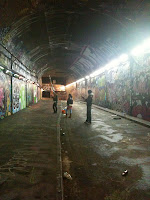
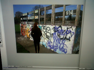
The graffiti all over the walls adds a young, edgy, urban look which is what we are trying to illustrate to reach our target audience therefore, the design and colours would appeal to them. The tunnel is almost abandoned which added to the isolated effect on our artist as this album is about how she is trying to fit into the world of fame.
The lighting was already pretty effective as it was dark but the lights on the side of the wall added a glow to the object in the shot.
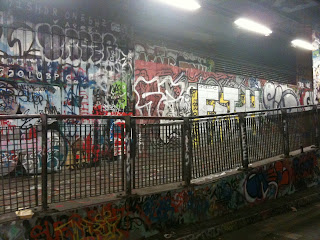
The props of the railings, rubbish on floor, lamp posts and filthy kerbs also added to the reality of the shot. This creates an attachable atmosphere where the listener could relate to the artist.
Subscribe to:
Posts (Atom)