We had a Photoshop programme workshop to help us increase our skills so we can end up with a perfect digi-pak and magazine ad.
I learnt many key things like; sorting out layers, inversing images, adding text, using the tools and all this will benefit me in creating a professional finish.
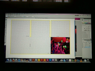 |
| I used random pictures just to experiment with the layout of the digi-pak , how to import the photos, inverse them and crop them without making them pixalated. |
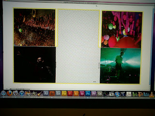 |
| I continued the same method for the following 4 panels. The top middle one is where the CD would be placed and the bottom middle panel is where the track list would be. |
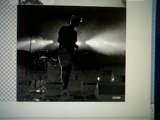 |
| I made this picture black and white, I really like the lights in this shot and want to achieve something similar to this for our own digi-pak. |


No comments:
Post a Comment