 |
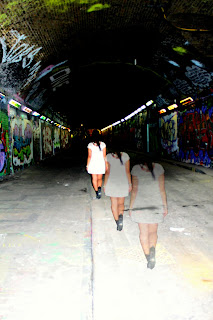
| This photograph could be used but adding the writing may take the focus away from the photo and look too busy which is not what we want. |
 |
| I edited this photograph earlier as a potential idea for our digi-pak cover and thought we could use it for the magazine advert so people could recognise it automatically. |
 |
| This photo sticks to the theme and illustrates the bad girl which could contrast with the digi-pak cover effectively. There is enough space to add all the information needed as well. |
No comments:
Post a Comment